
POP UP TYPE museum
exhibition branding
project
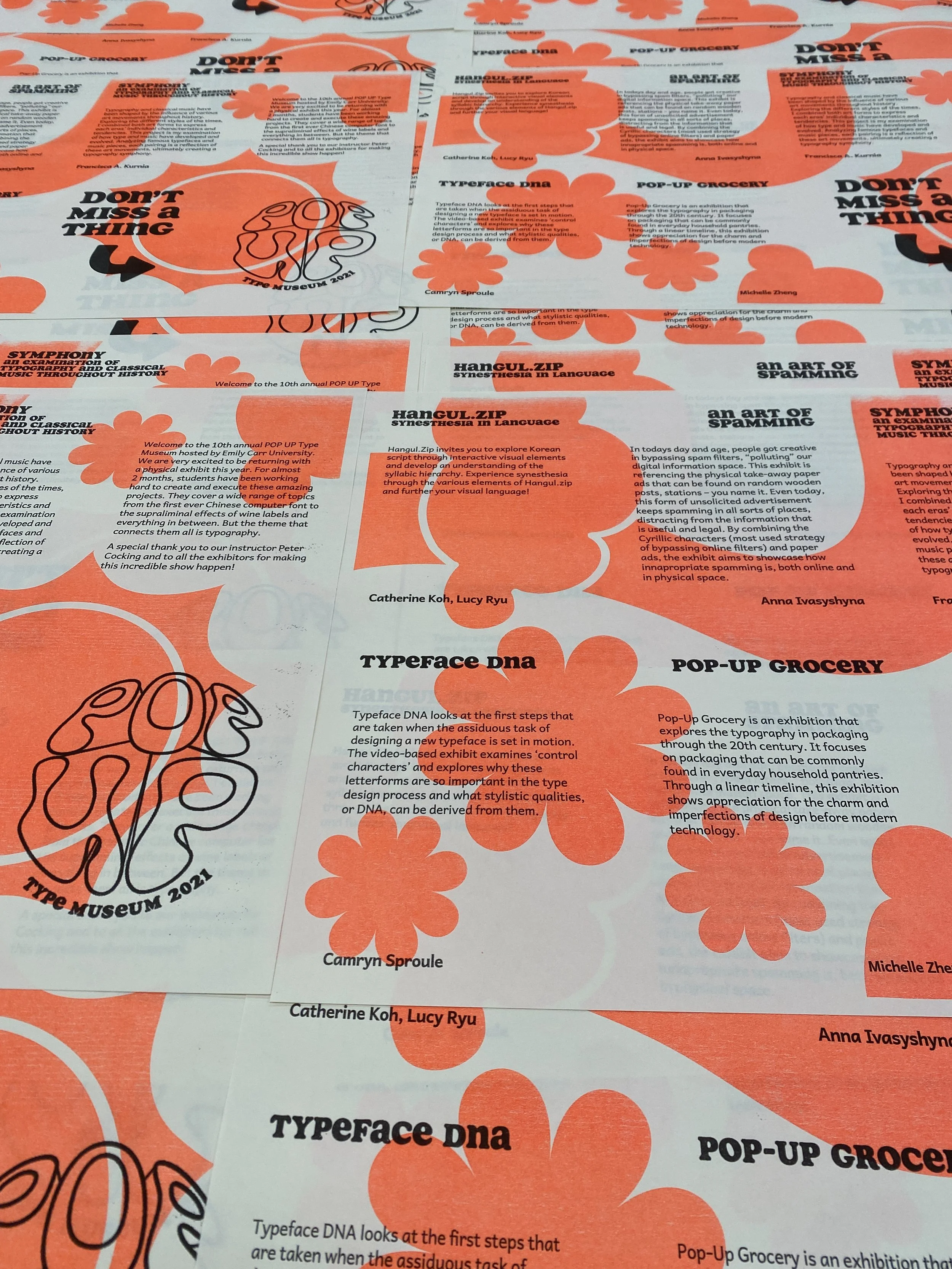
The Pop-Up Type Museum is a yearly exhibition put on by the Advanced Typography class at Emily Carr University of Art + Design. The exhibition brings together Vancouver designers and type enthusiasts. In the exhibition, individual exhibitors showcase different aspects of typography through their visual and written typographic research, usually including interactive and take-away elements.
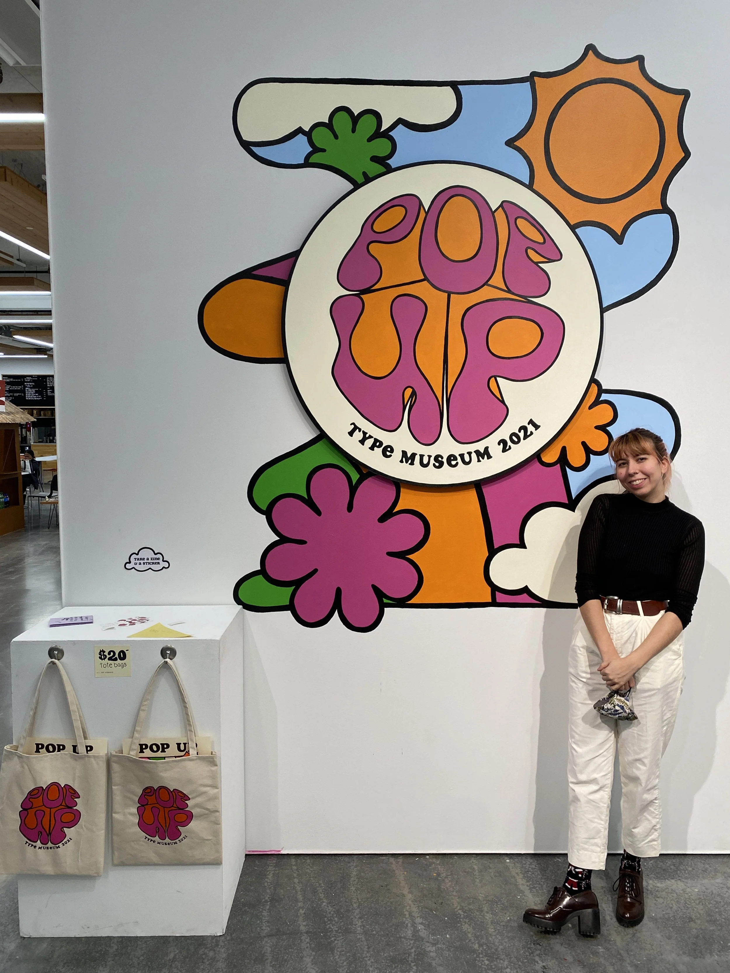
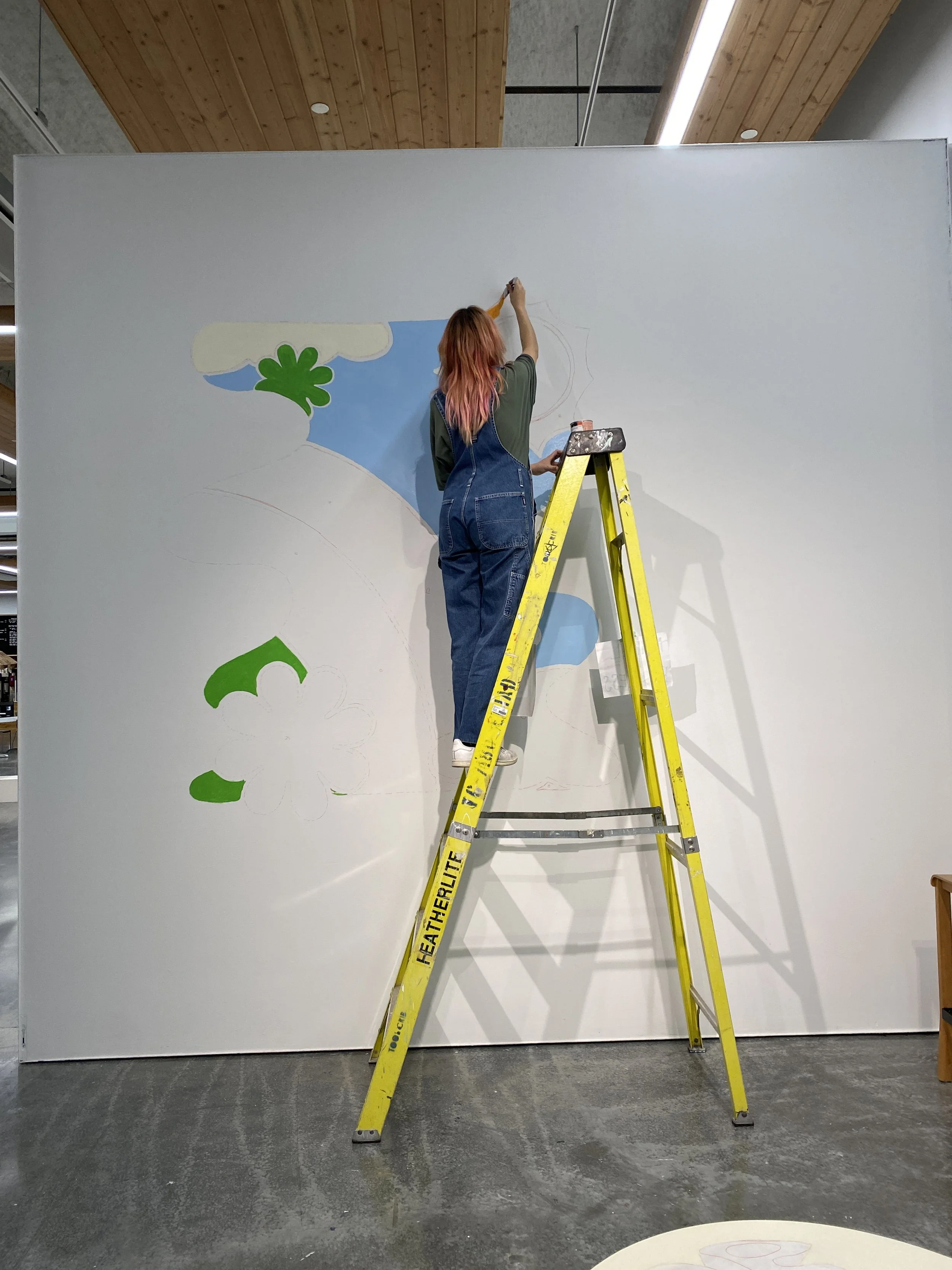
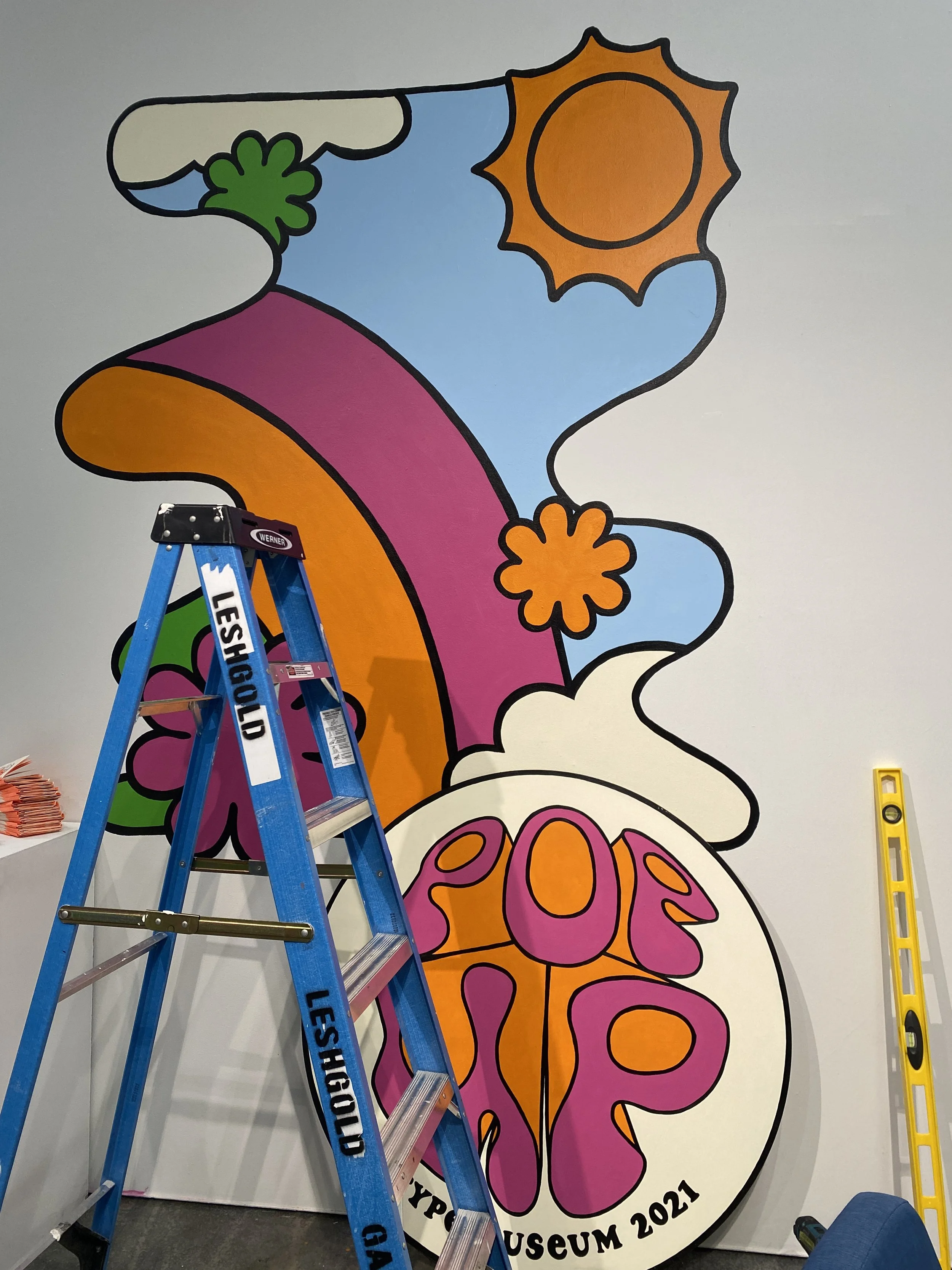
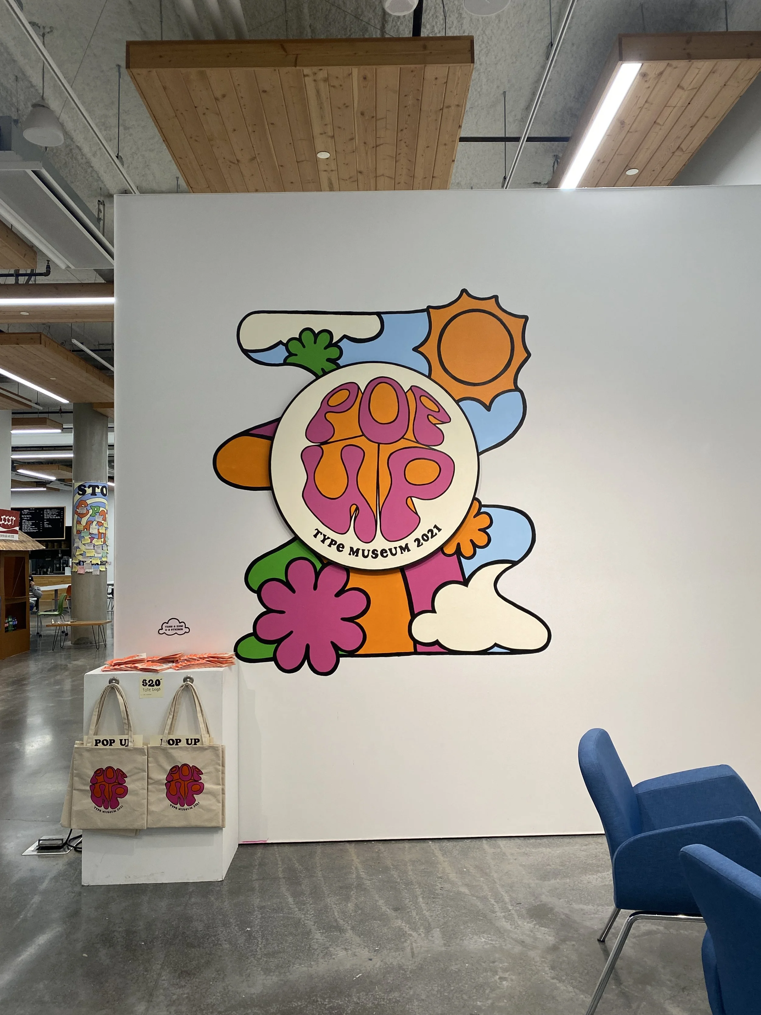
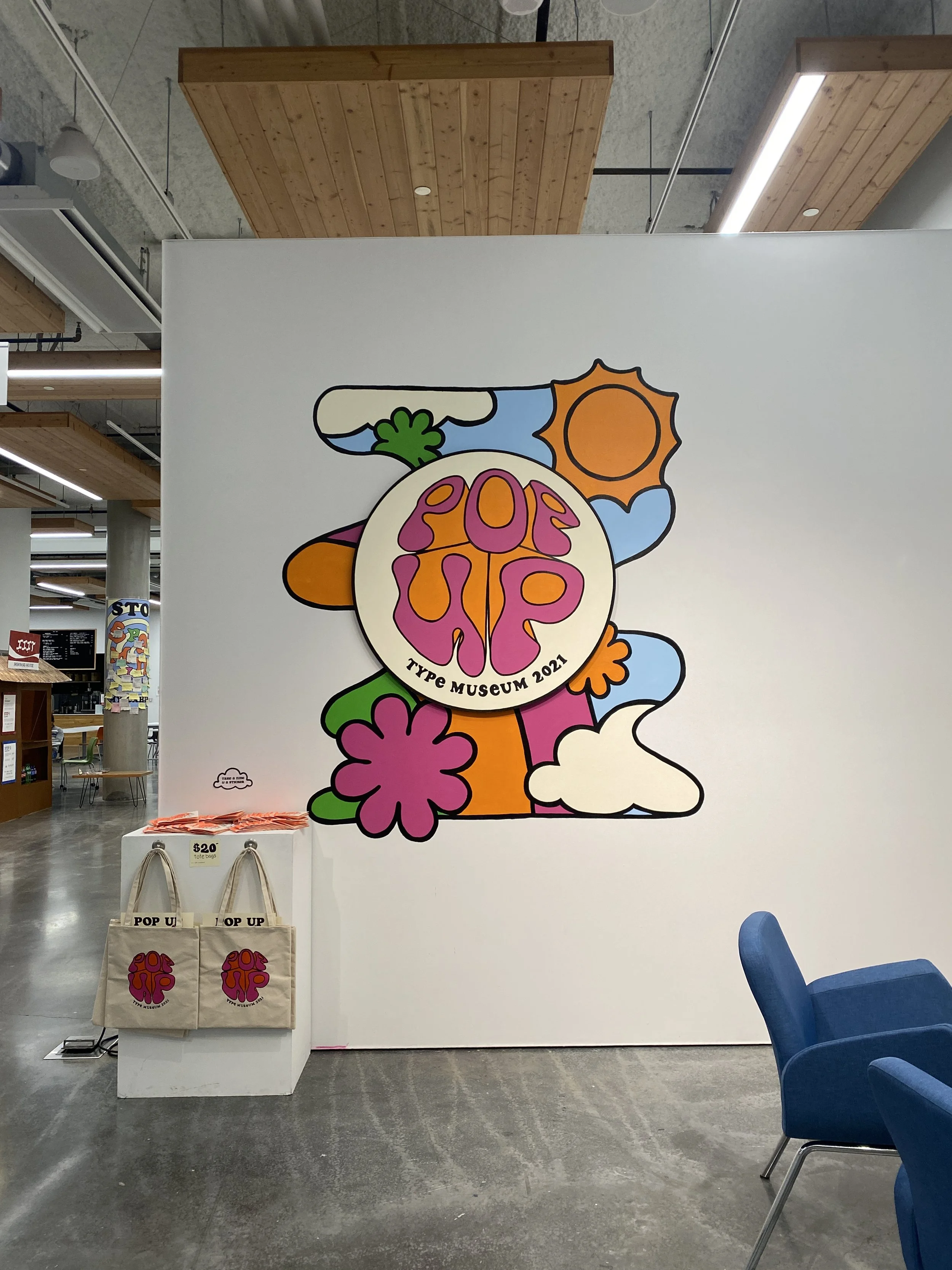
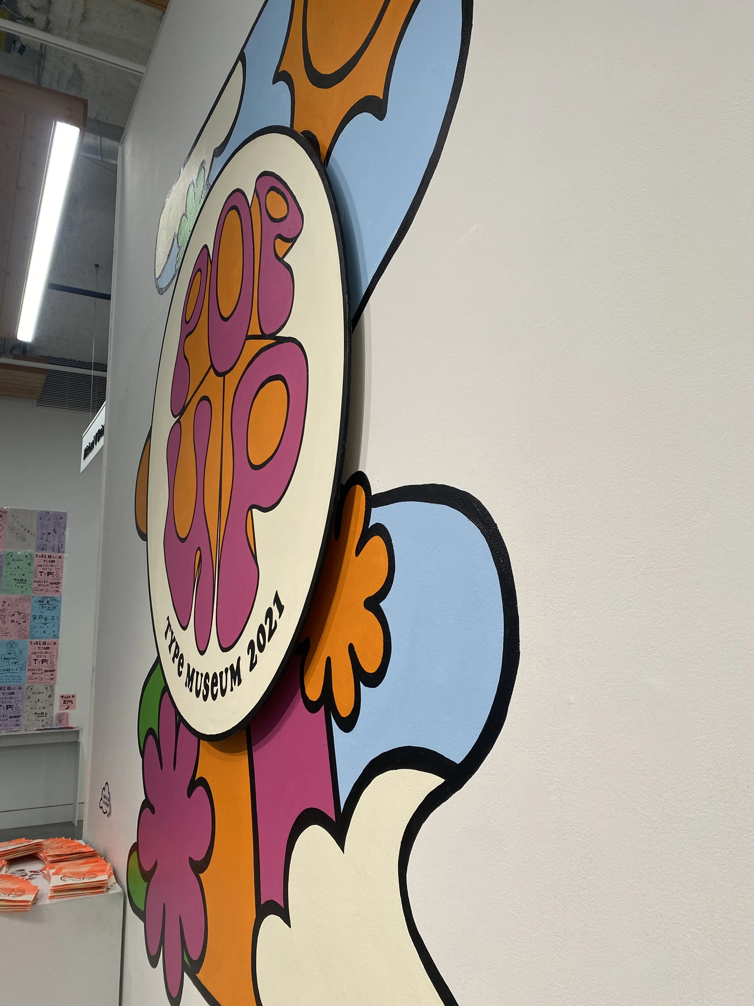
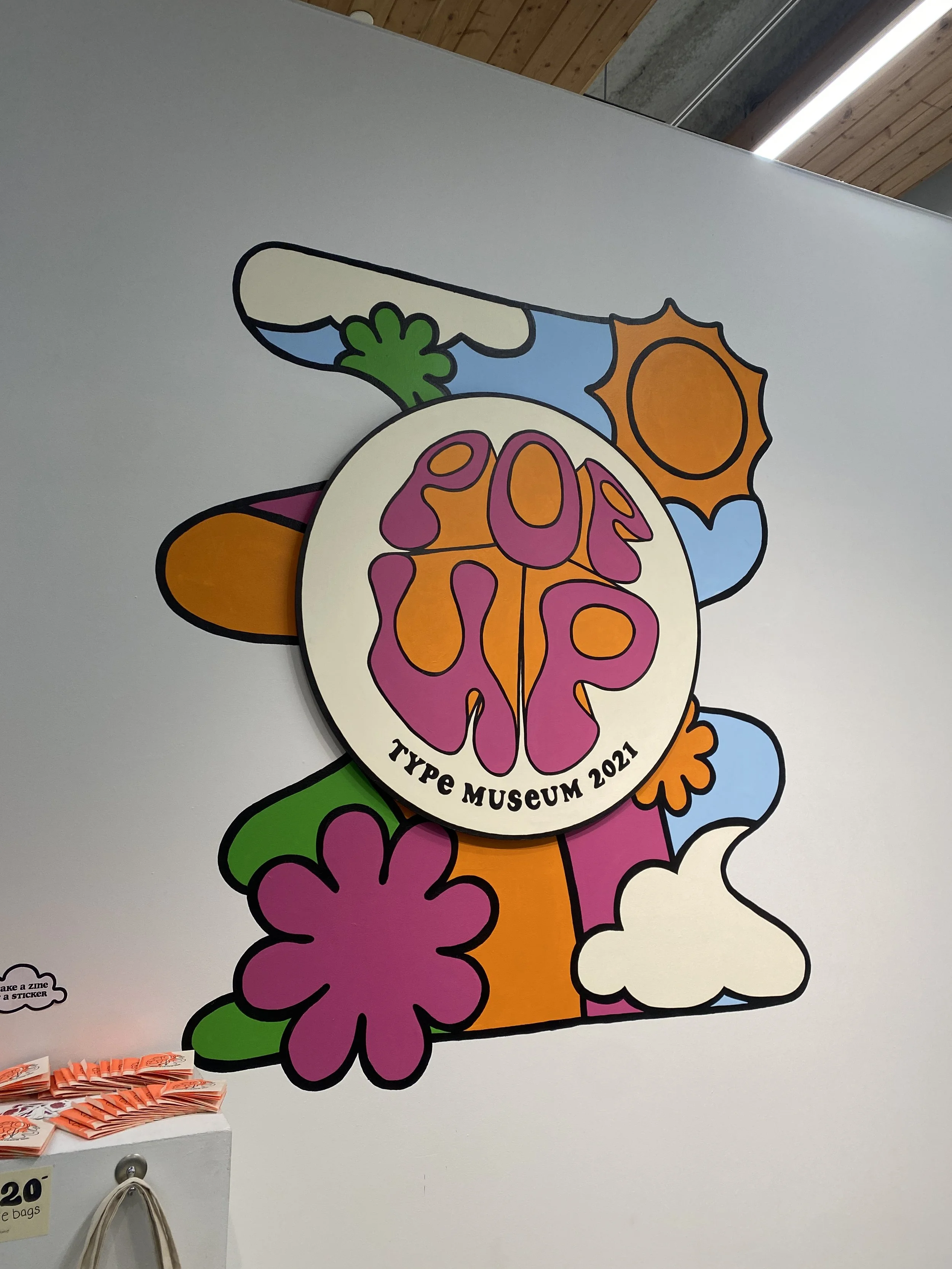
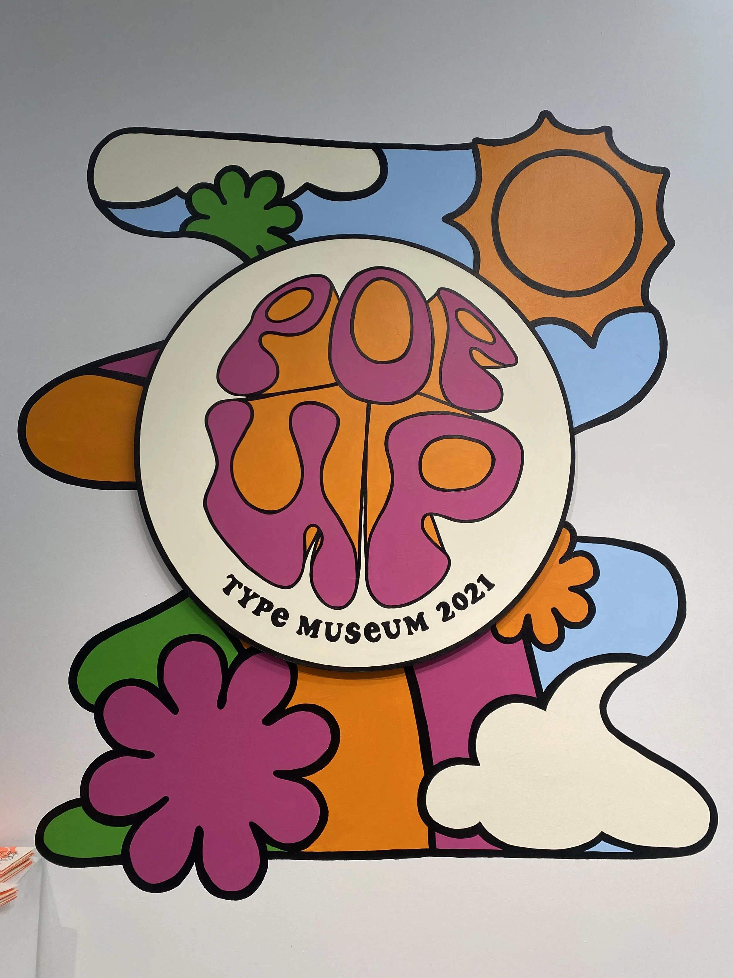
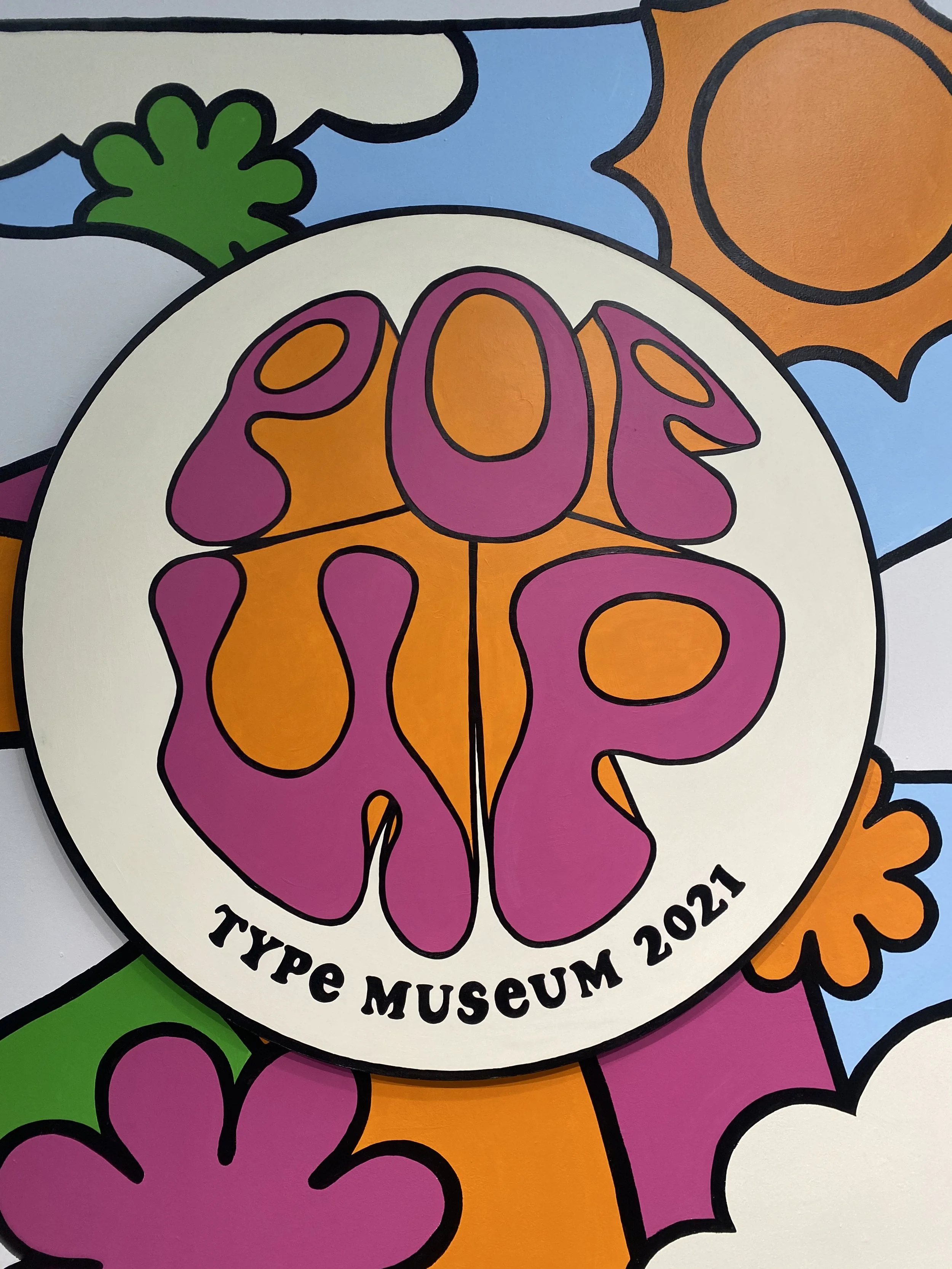
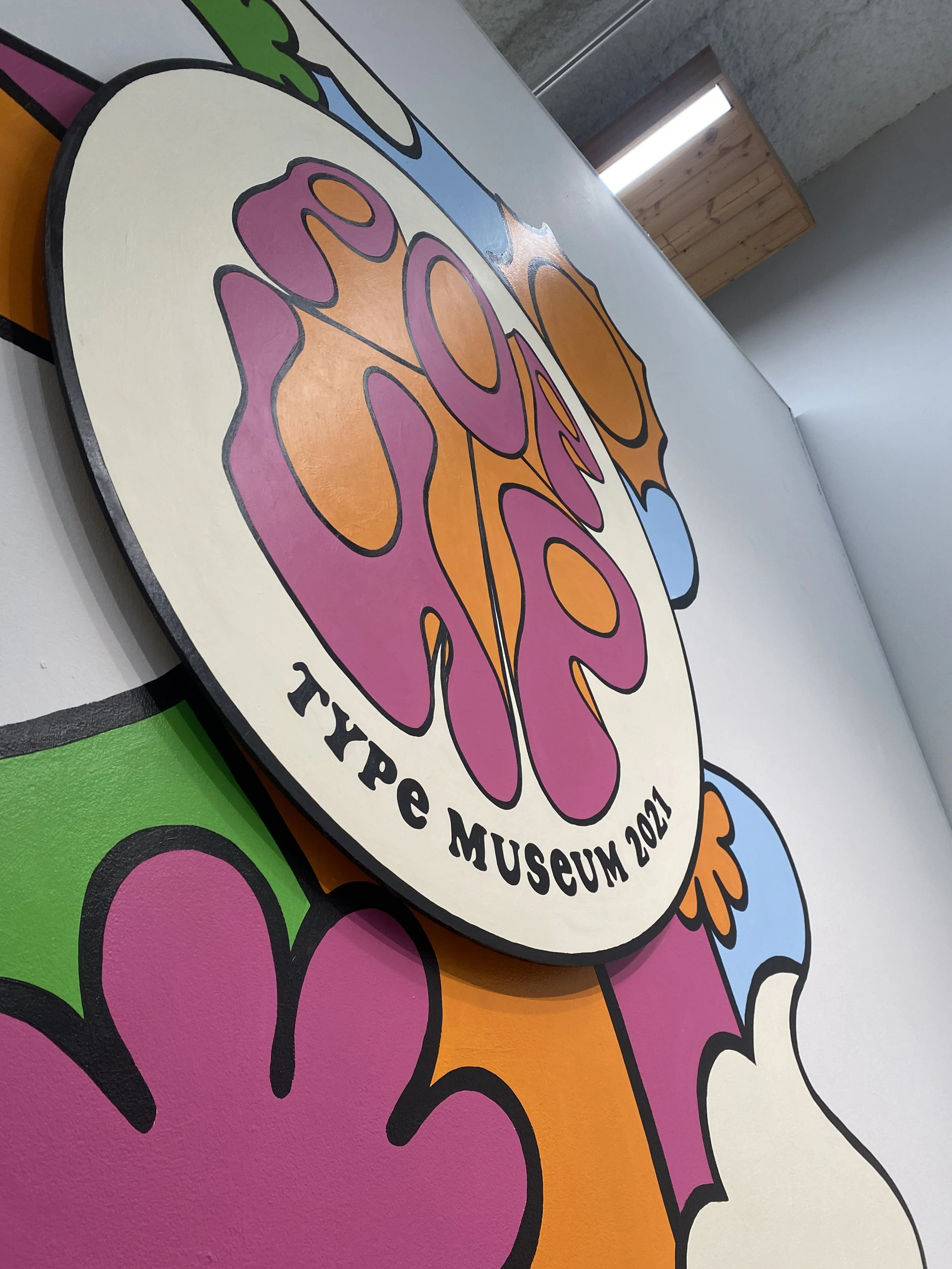
The contents and themes of these exhibits cover a wide range from the first Chinese computer font to the supraliminal effects of wine labels. When creating the overall branding for this show, we wanted something that would unify everything while being strong in its own right. This year many of the exhibits were focused on vintage typography, which prompted this 60’s/70’s hippie inspired approach.
EPHEMERA
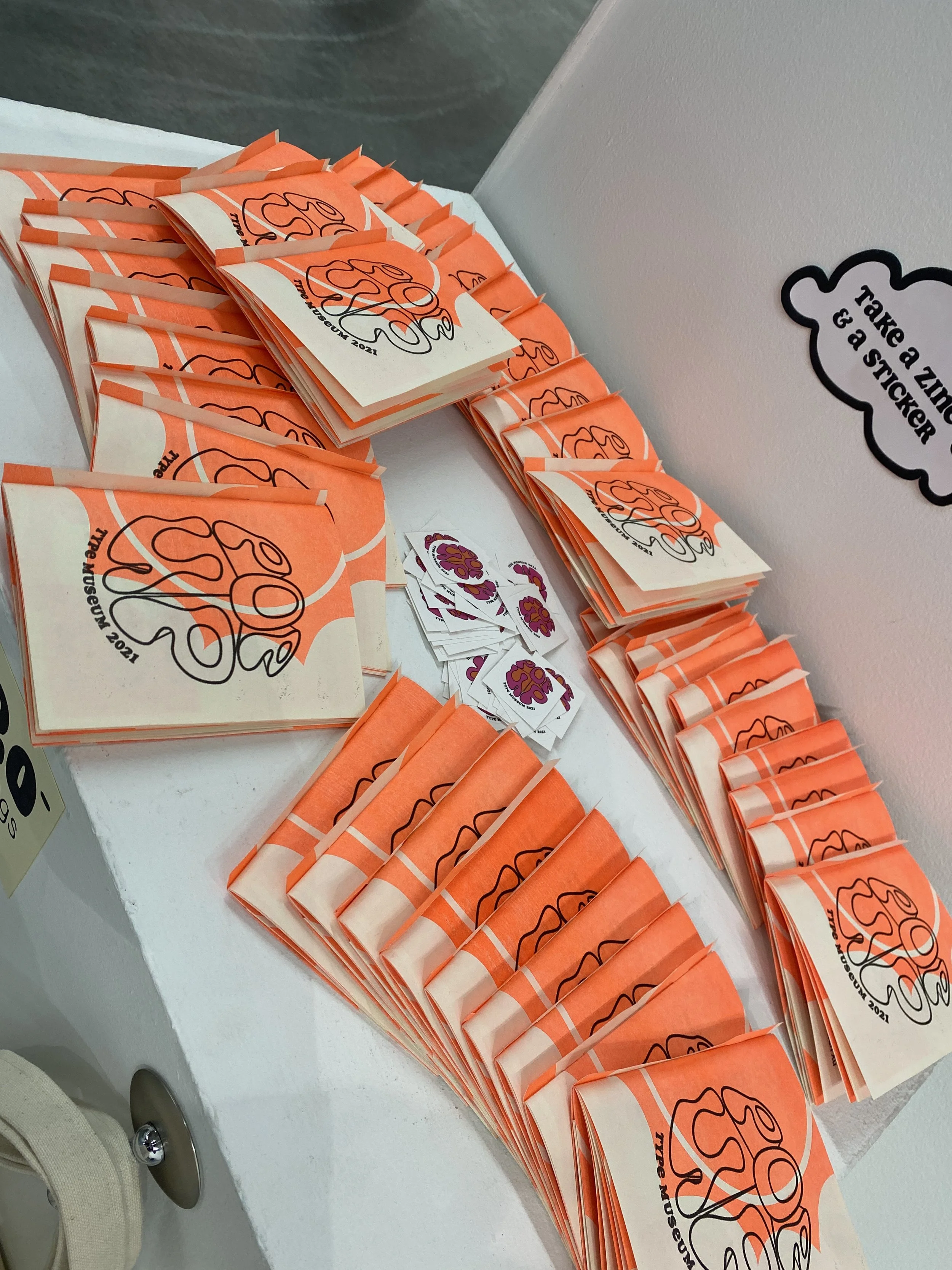
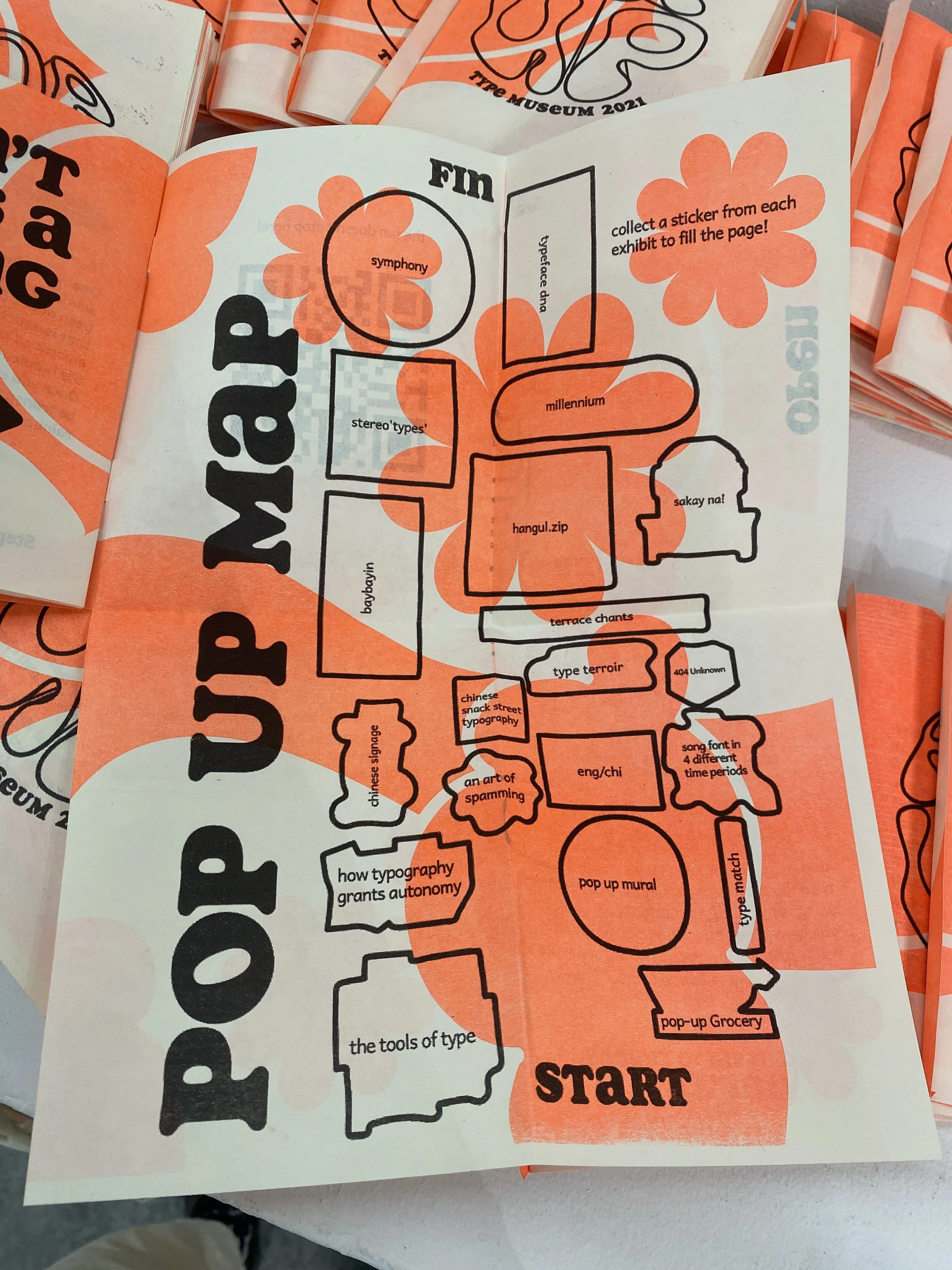
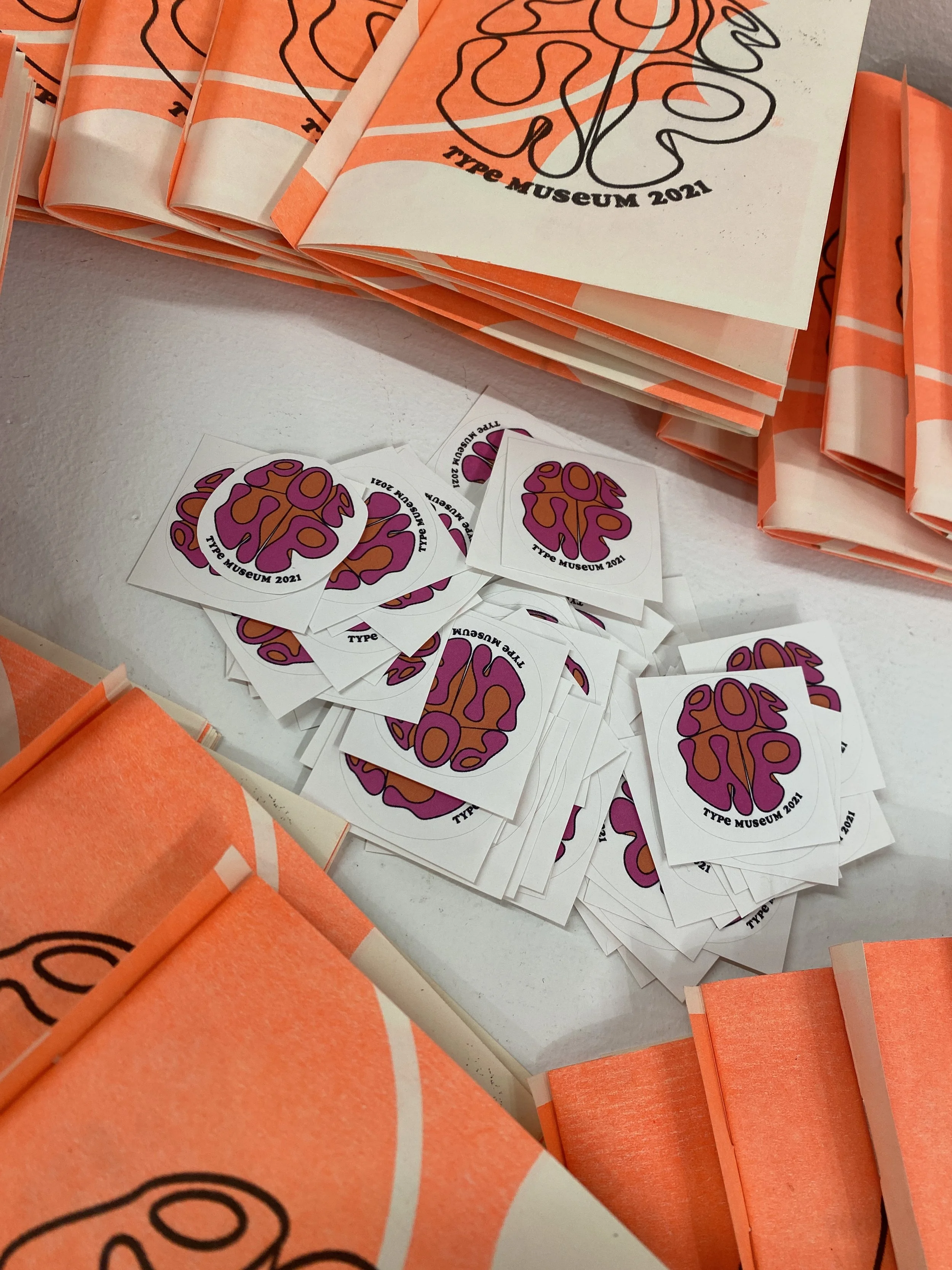
I created a variety of ephemera for this project, including:
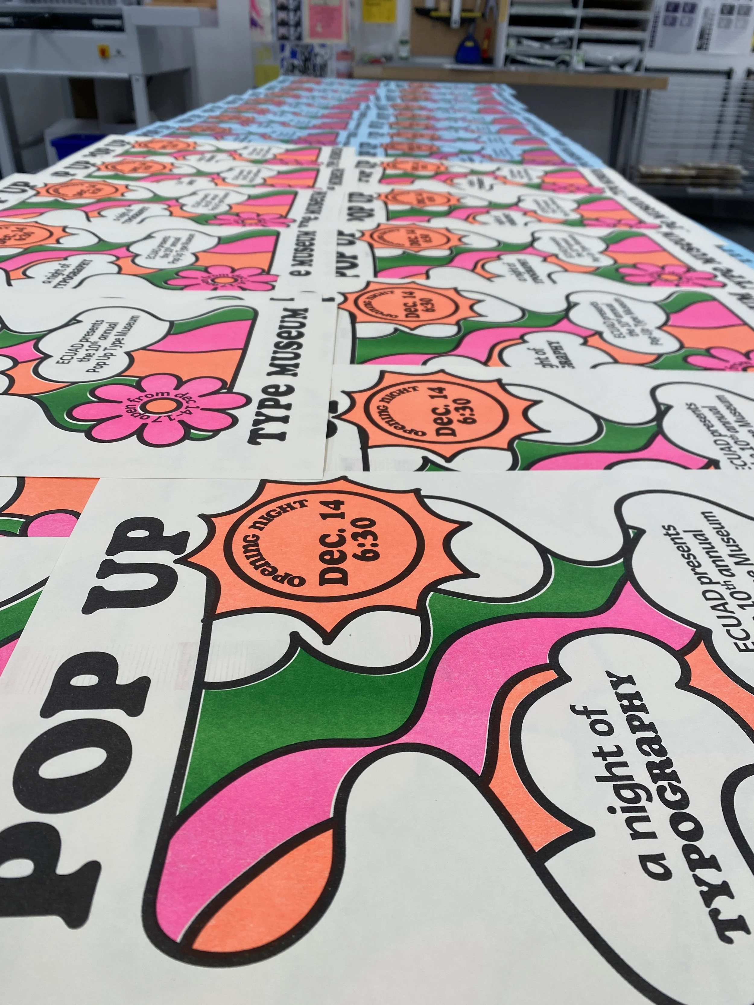
print & digital @popuptypemusuem promotional materials
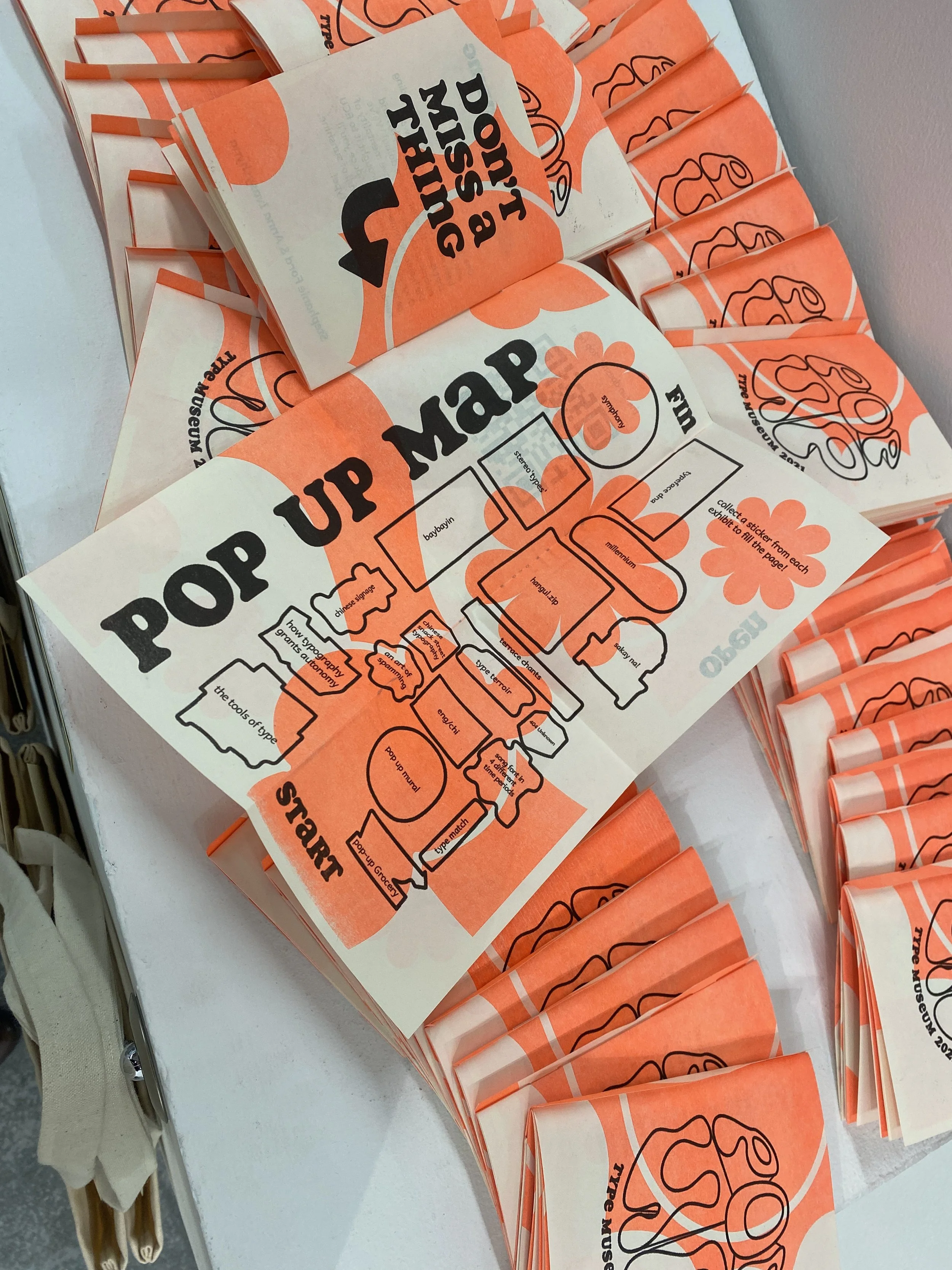
information booklets that included an interactive map, encouraging viewers to visit each exhibit
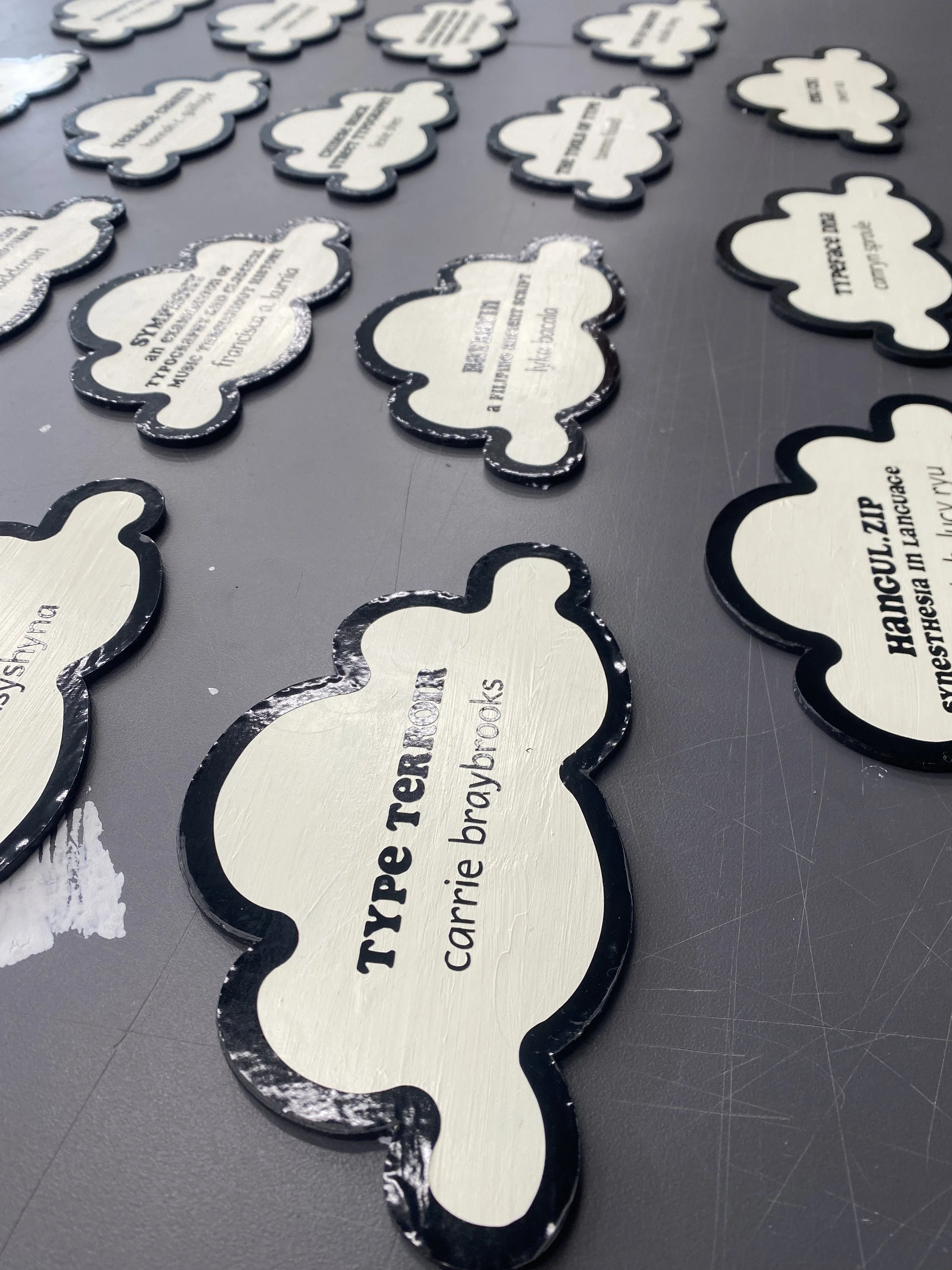
plaques for each exhibit that are subtle enough to not interfere with individuals aesthetics but still stick to the core branding
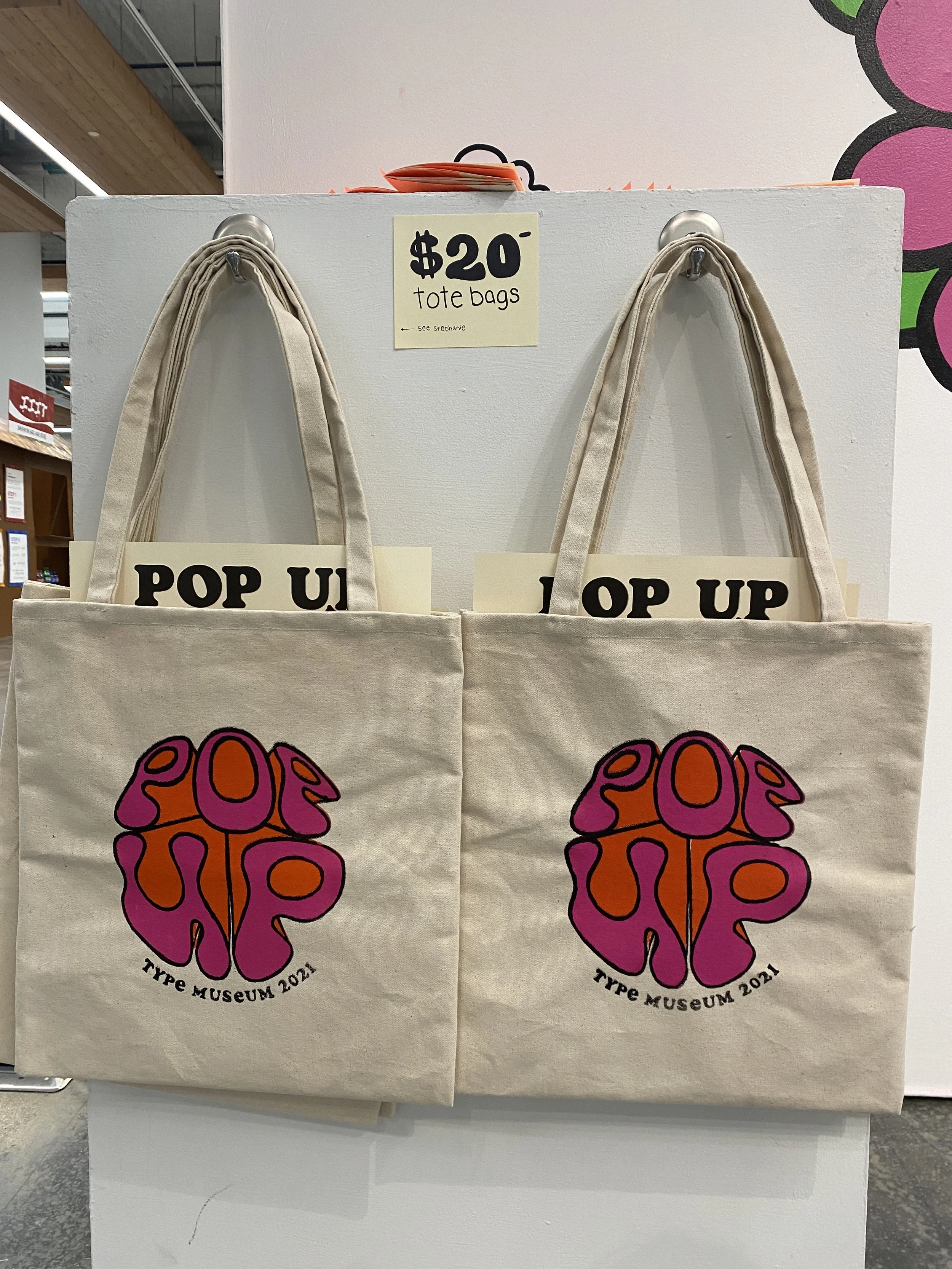
Hand sewn and printed tote bags featuring the logo that include all printed ephemera from the show.


special thanks to
Ana Ivasyshyna- my branding partner who focused on the digital side of this exhibit
Peter Cocking- Our Type instructor for the exhibition
& All my fellow exhibitors
Typefaces:
Soap- Designed by Ray Larabie
Andika New Basic- Designed by Victor Gaultney, Annie Olsen, Pablo Ugerman